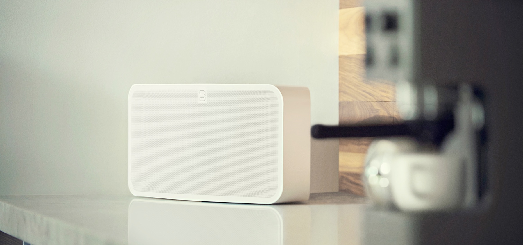
Bluesound Network Speakers
UX x UI
Bluesound, producer of Hi-Res audio network-speakers from canada approached me to help redesign their apps across all platforms. I stepped into a team of developers as well as a ongoing product-cycle and shipped more than ten releases for the app as well as three hardware-models and dozens of features.
Bluesound, producer of Hi-Res audio network-speakers from canada approached me to help redesign their apps across all platforms. I stepped into a team of developers as well as a ongoing product-cycle. I have the pleasure to work on all areas of the app. My first steps were to identify pain-points and adapt possible adjustments to the releases and production of features and new hardware. For two years now I am the UX/UI-core of the team and shipped more than ten releases for the app as well as three hardware-models and dozens of features.
01 –
01 –
User Experience
User Interface
Say Hi!
Based on user-feedback and research, our first move was to make users feel at home right after they unboxed the device or installed the App. Right after the installation I created an onboarding-flow which guides the user to the most important areas of the app. These hints are used across the App to guide users in crucial situations.
02 –
UX & Concept
User Interface
UX & Concept
User Interface
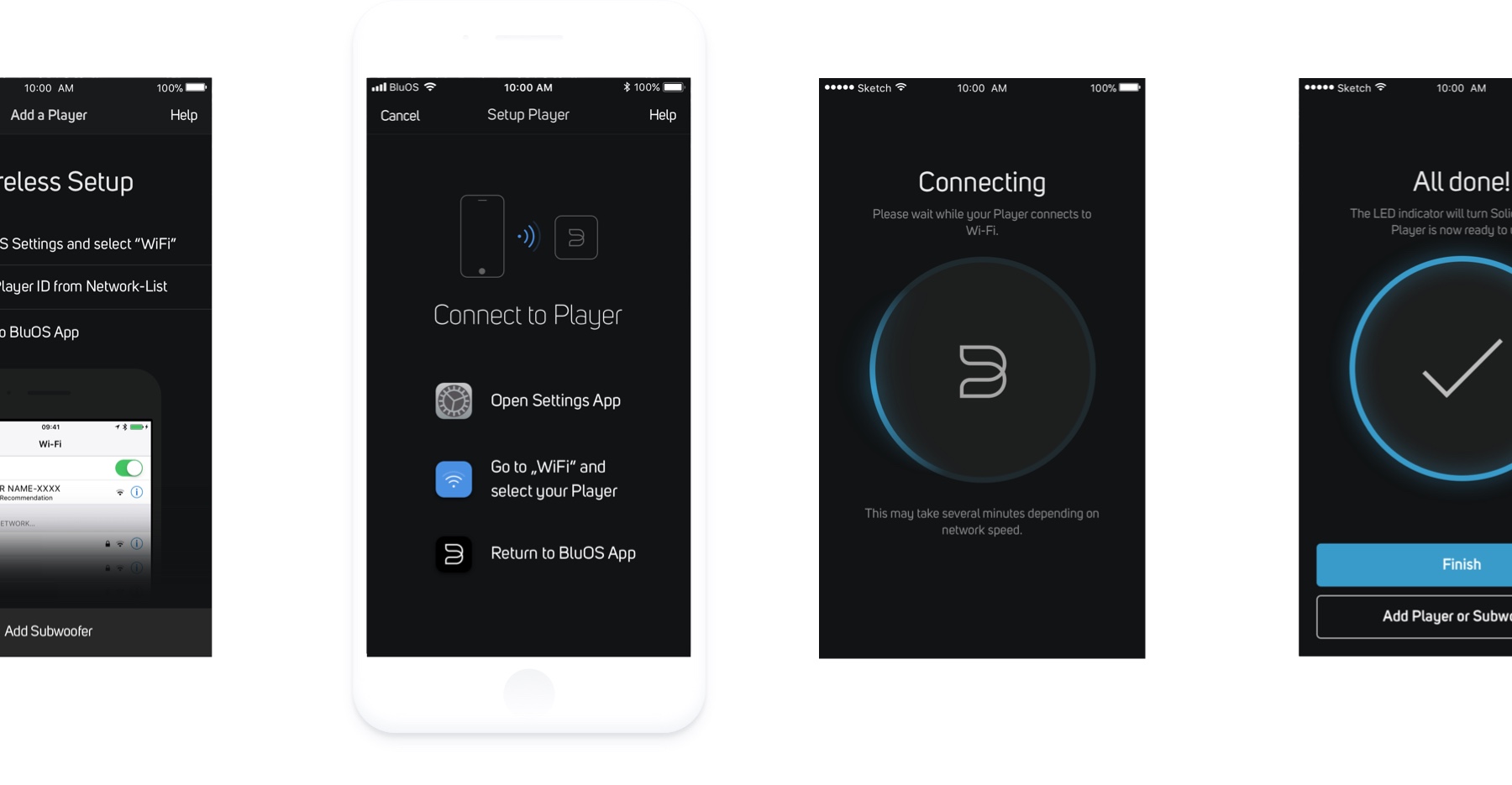
Setting it Up
Come on Board
For the setup-processes of the devices it was my goal to bring silicon-valley-style setups into the game. Since you have to consider real-life-scenarios as well as digital interfaces, this was a challenge. Through research and endless user-feedback we created large amounts of wireframes for this project and synced with Dev to make sure everything works flawlessly. For iOS I had to make sure people go into settings, connect to the players WiFi and return again. For Android everything connects and runs almost automatically. I used destinct iconography and layout to make it easy for both systems to setup a new device.
03 –
User Experience
User Interface
Illustration
All aboard!
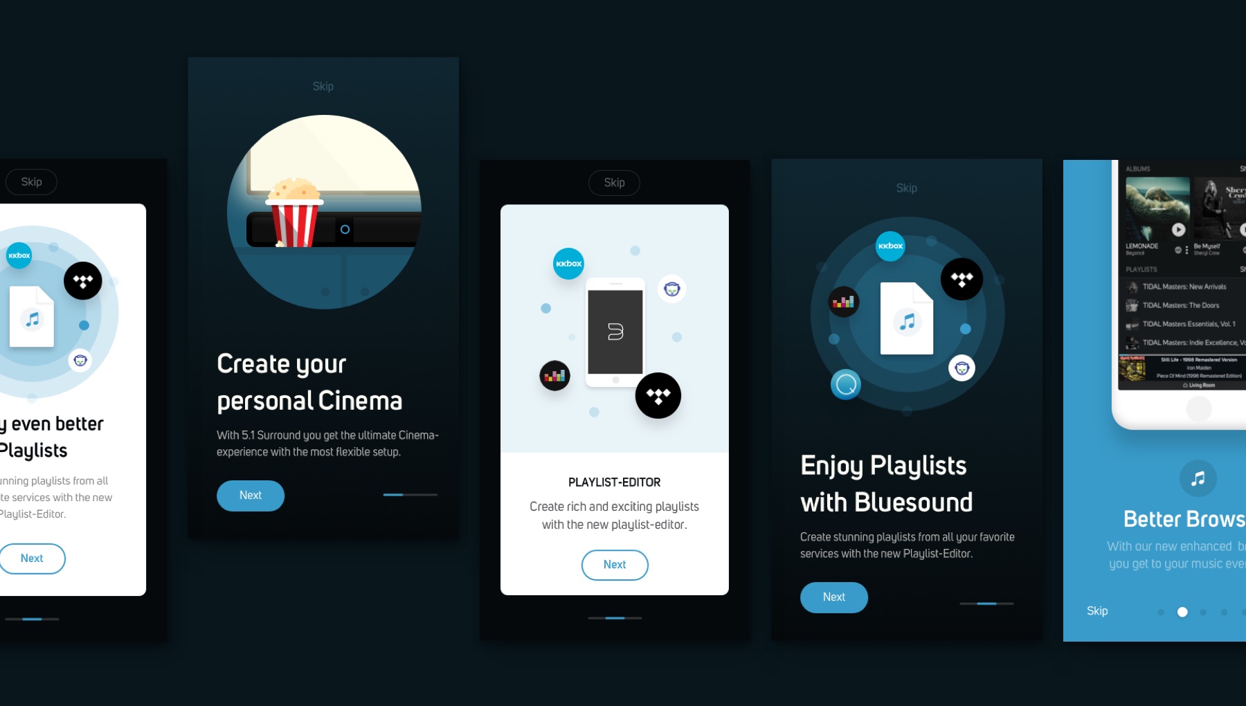
Communicate Better
Bluesound had the need to communicate new features better to existing users since explaining new features can be more than just a two-liner. I proposed to create update-onboardings as well as a news-section for users to learn about new services as well as technologies like MQA. I created illustrations in Adobe Illustrator or directly in Sketch and animated the elements with Framer. Creating prototypes was crucial so all elements were in line with project-mangers intent.
04 –
UX & Concept
User Interface
UX & Concept
User Interface
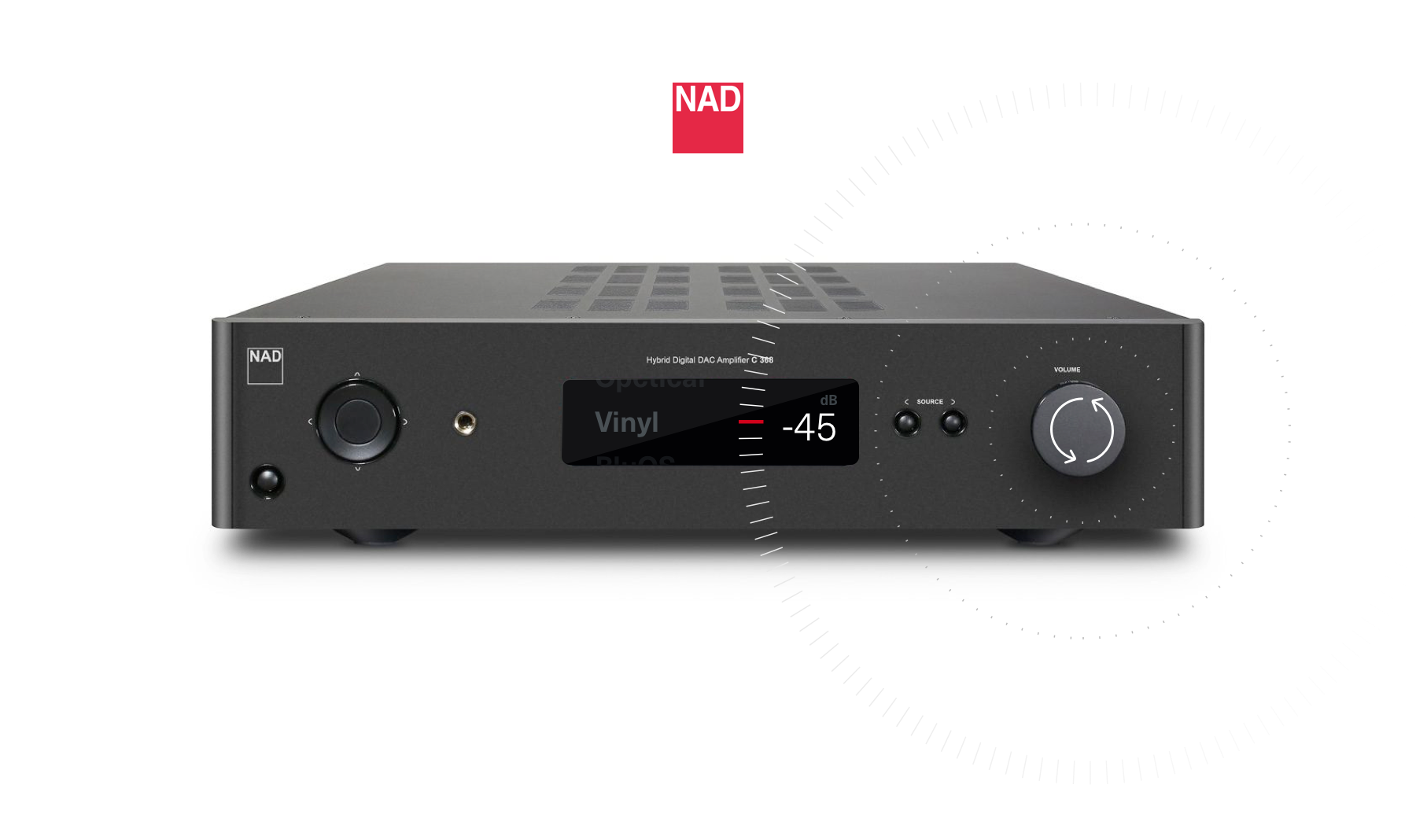
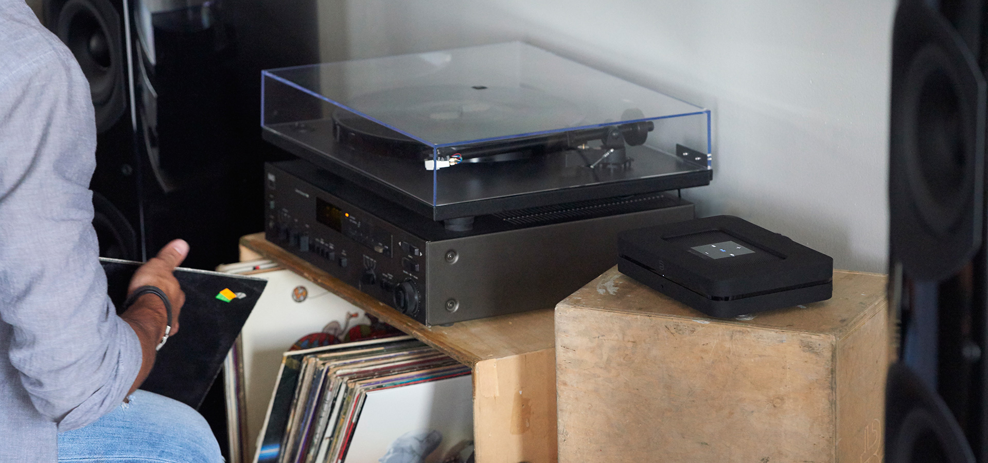
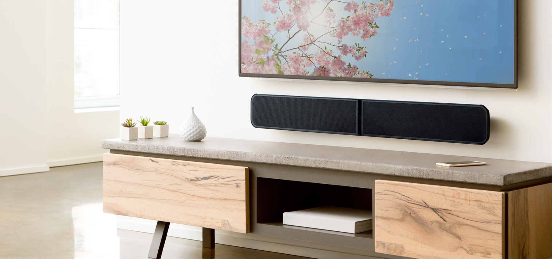
From App to Amp
Come on Board
To unify the experience between application and hardware, I was asked to design a OS that works for onscreen-devices too but is based on the heritage of NAD-devices. Based on user-feedback I took endless problems into account and looked at previous generations of NAD-amps to create an operating-system based on the golden ratio and inspired by Braun-Vinyl-Players. The result acts and feels like a bridge between software and hardware.
05 –
UX & Concept
User Interface
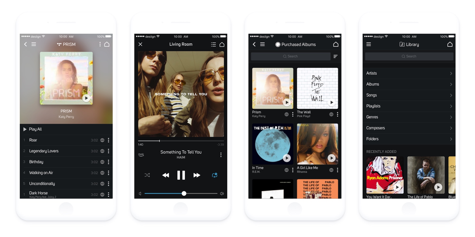
Redesigning Browsing
Browsing 180°
Previously, all services and sections were separated with a slider-mechanism, all laying side by side. This caused more and more trouble as services and features came on board. We identified all the services navigation-styles and designed a whole new browsing-experience and integrated it into the two-sidebar-navigation (left and right). All built with Sketch Symbols and libraries. We went through different stages with user-research, devs chiming in and lots of iterations to bring the product to users with the framework first and low-priority-elements later.
06 –
05 –
User Experience
User Interface
Iconography
Making a Scene
Making a Scene
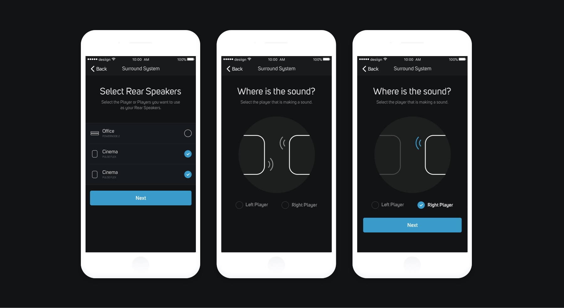
To make it easy for users to create a stereo-setup or surround-setup of players, the developers and us introduced a sound-mechanism which, unlike competitors, does not need users to stand up from their couches to finish the setup. By telling the app just one of the sides, the app makes assumptions and intelligently adds the missing players to the stereo- or surround-system. I worked out the concept, illustrations and design together with developers side by side.
To make it easy for users to create a stereo-setup or surround-setup of players, I introduced a tone-mechanism which, unlike competitors, does not need users to stand up from their couches to finish the setup. By telling the app just one of the sides, the app makes assumtions and intelligently adds the missing players to the stereo- or surround-system. Especially with surround-setups (multiple rears and one soundbar) the user has to make just one click and the rest is done. I worked out the concept, the flow with wireframes and created illustrations and setup-designs from start to finish.
07 –
Art Direction
User Interface
Getting the right Feel
Since BluOS had no defined design-language, I created this moodboard and wrote my ideas about look & feel under each category. I went back and forth with stakeholders of the company to get the exact kind of feeling they want to create with their product and general vision. Based on this I made much more sophisticated design-choices and were much more aligned with the clients perspective.
08 –
FramerJS
Prototypes
Nearly every design-handoff has been accompanied by a FramerJS-Prototype to illustrate the behaviour and the final outcome. These had been used to communicate to the client as well as developers.
Well, I'm looking for new opportunities, so if you're interested, get in touch or tweet me.