cunio
UX x UI
cunio is an App for tenants to connect and for landlords to monitor problems and damages of buildings. The client approached me with their problem and let me lead the Art Direction, UI and general UX of the App. The App have won several prices across the globe in 2017 and is about to get even more funding and traction in the coming years.
cunio is an App for tenants to connect and for landlords to monitor problems and damages of buildings. The client approached me with their problem and let me lead the Art Direction, UI and general UX of the App. The App have won several prices across the globe in 2017 and is about to get even more funding and traction in the coming years.
Bluesound, producer of Hi-Res audio network-speakers from canada approached me to help redesign their apps across all platforms. I stepped into a team of developers as well as a ongoing product-cycle. I have the pleasure to work on all areas of the app. My first steps were to identify pain-points and adapt possible adjustments to the releases and production of features and new hardware. For two years now I am the UX/UI-core of the team and shipped more than ten releases for the app as well as three hardware-models and dozens of features.
01 –
01 –
User Experience
User Interface
General Art Direction
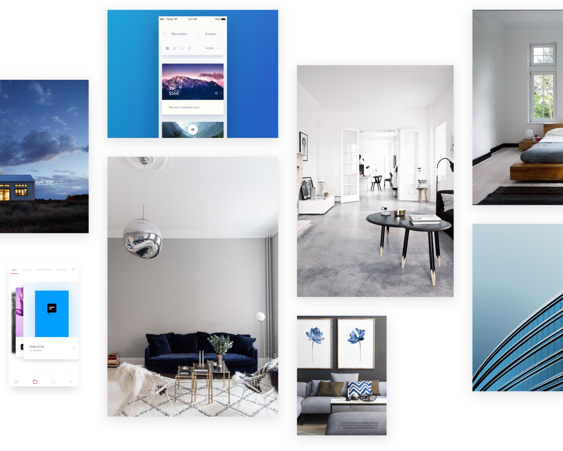
The client asked me to step into the project and get my ideas of brand and vision in there. I started with thinking about the people that the App will use later. By identifying their needs and by getting the different target-groups in place, I created three guiding principles for the App: sky, air and concrete. Based on these ideas I created a color-scheme, chose typography and photography as well as designed interactions.
FROM THE MOODBOARD
"Blue is the color of trust, which relationships are build on. Grey is the color of cement and steel, which buildings are made of. Together they build a relationship of principles that we unite in cunio. Landlords should be seen as trustworthy and reliable when using cunio and, on this way, attract more tenants through that."
02 –
UX & Concept
User Interface
UX & Concept
User Interface
Getting Social
Come on Board
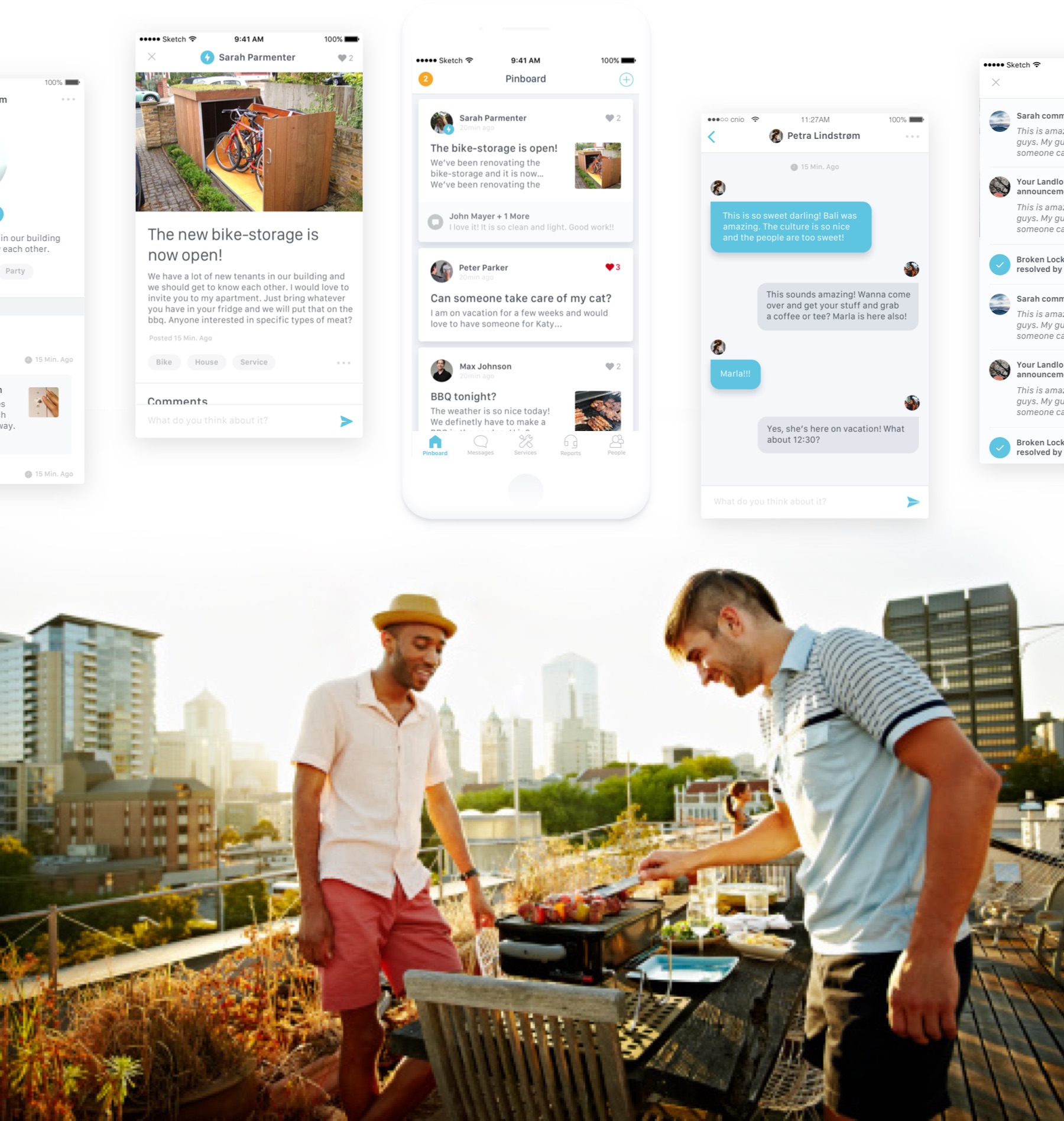
We started with the social-features of the App. Tenants are able to connect through a virtual board for their house. I created a card-based approach to make the information more agile. I took classic social approaches and combined them with features like "neighbour-alarm" so neighbours can come to your help in tricky situations. On the design-side I used whitespace a lot to separate areas instead of using plain lines and used that airy feel from the moodboards.
03 –
User Experience
User Interface
Data!
Communicate Better
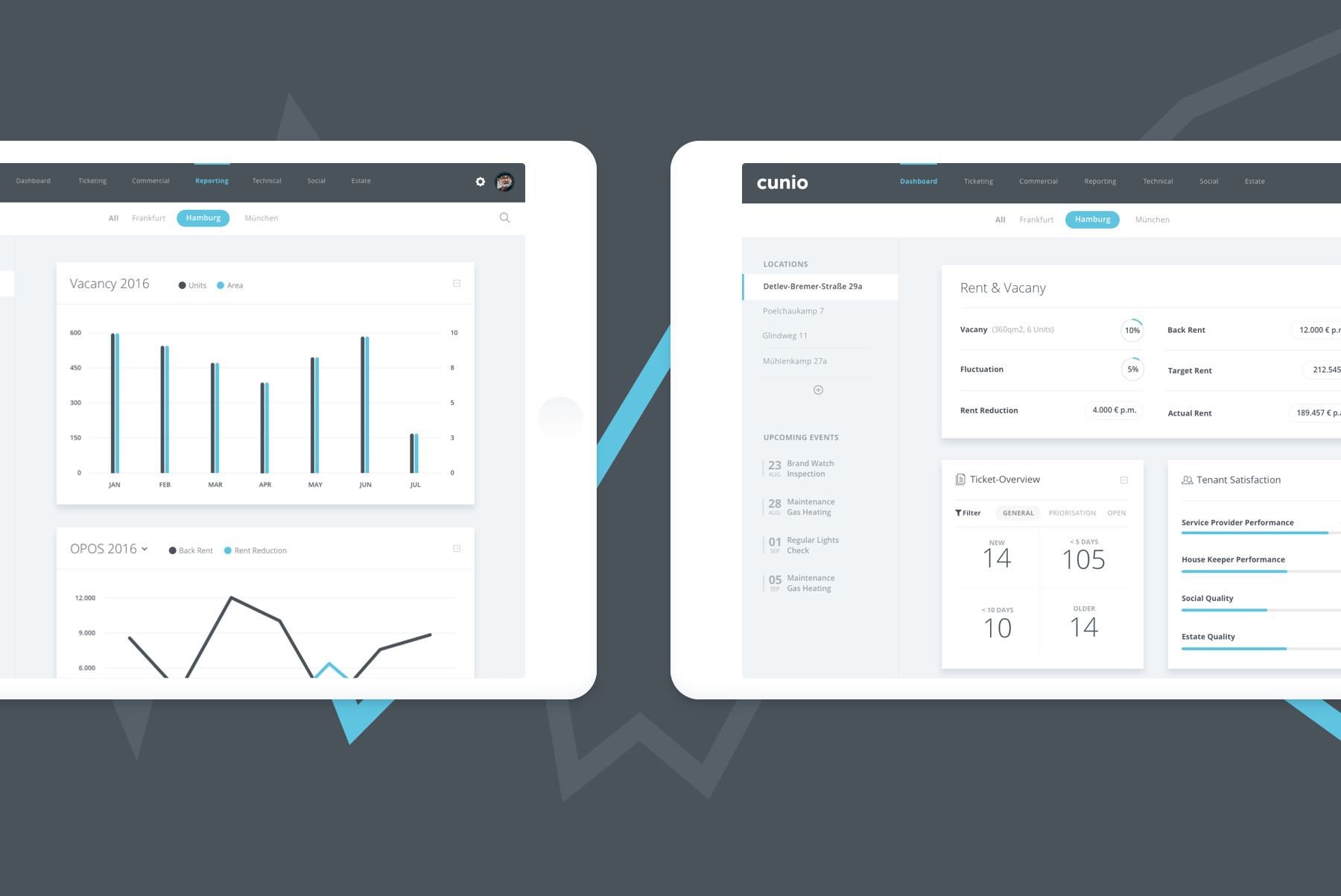
The outcome of users reporting the damages and leaving ratings was, that landlords could measure qualities and satisfactions in one simple dashboard. I created a "pro style" of the design I was using for tenants and designed a view, that was not just easier on the eye (and focues on tasks) but also handling graphs and statistics well. I designed this for iOS, Android and Desktop.
04 –
UX & Concept
User Interface
UX & Concept
User Interface
In Between
Come on Board
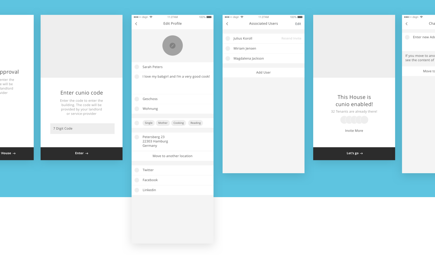
This is not your usual social platform. Since users are not just users but residents and often change buildings or have new spouses or room-mates, users have to checkin for new buildings or add and delete new users. These approval-processes and other fragments took far more time than any other part of the App. I took a lot of inspiration from social-media-sites like Facebook but had to make my own assumptions for parts of the App that had no predecessor. By making A/B-testing with potential users I paved my own way through it.
05 –
UX & Concept
User Interface
Webdesign & Brand
Browsing 180°
I wanted the features to be communicated perfectly. The client asked me to create a website which gets the core of the App: communication. I tried to get emotion through photography and made the outcome for the tenants center of the text (which I wrote by myself). The page is primarily talking to end-users but has a few CTAs targeted towards landlords and professionals, especially at the end of the page. Since the approach was to get users first and landlords later. I created the logo as well as the color-palette for the project.
